.png)
HAMLEYS SCRUMPALICIOUS PACKAGING 2022
THE CHALLENGE
SOLUTION
DESIGN SYSTEM
Hamleys launches Scrumpalicious
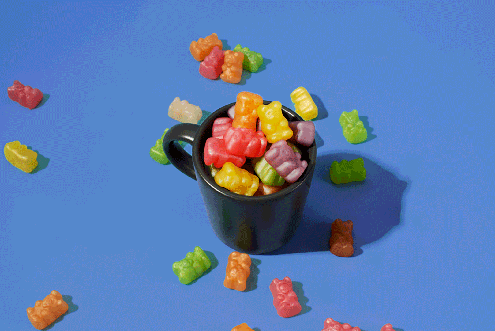
Hamleys, the iconic London-based brand, introduced a new range of chocolates and candies under Scrumpalicious at Jio World Drive, Mumbai. The concept aimed to craft a playful narrative that sparks curiosity and excitement among children.
How do we create and visually display a narrative that keeps the essence of London and appeals to an Indian audience ?
We tied a story that intrigues both kids and teenagers. The narrative revolved around a Post office nestled with tiny hard working gnomes, working day in and out to make these yummy goods. However a tiny naughty gnome called "scrump" acts as the protagonist here.
His mischievous ways act as the source of play and intrigue amongst
the audience.
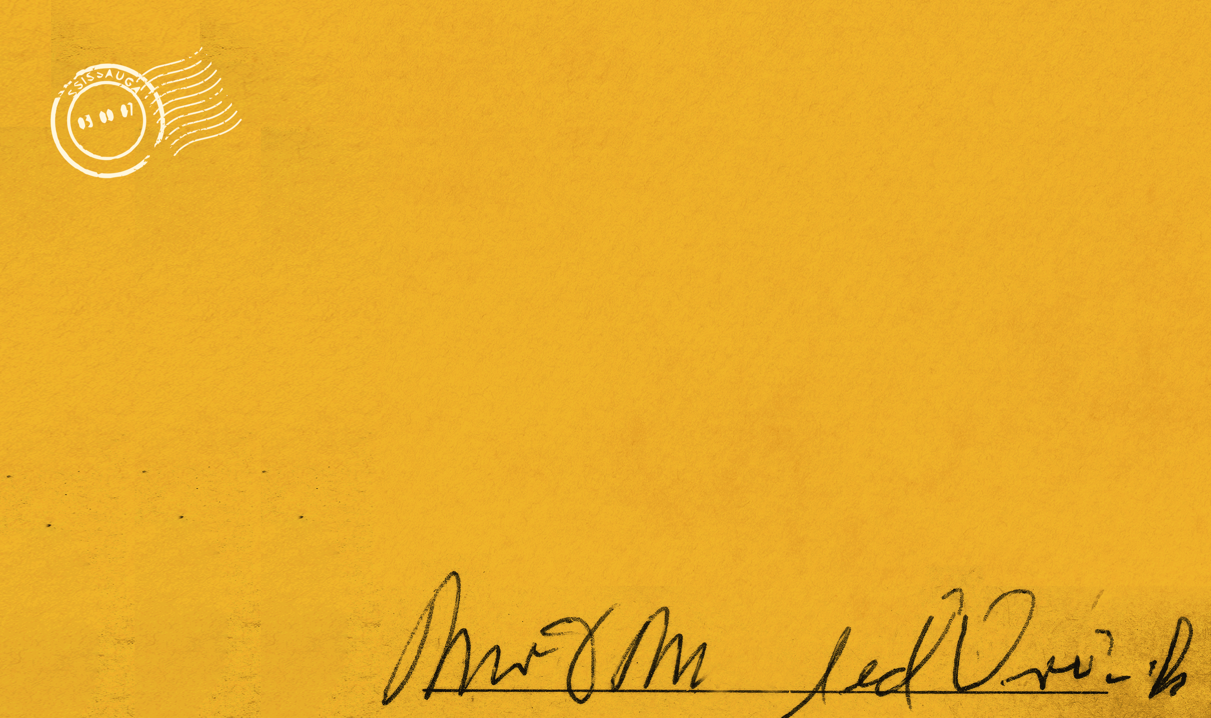
Blending Hamleys’ London legacy with India’s love for colour, we used a bright, saturated palette and playful London icons such as the London Eye, Big Ben, the mail van and old english post boxes to create packaging that delights children and stands out on shelves.


DESIGN SYSTEM
The typography of the packaging plays a very important role hence the typeface had to be such that exuded old world charm, a sense of modernity and playfulness. We used a Victorian Decorative font named "Nicolas" and tweaked certain areas such as the descenders for a better visual flow.
further added a curvature to the overall look to add a zing of playfulness