TOPEARTH STRATEGY, CONCEPT AND BRANDING
THE CHALLENGE
Engineered by Nature
TOPEARTH is a new venture capital who aims to back the next wave of big business opportunities built on bold ideas, a strong consumer pull and a sustainable approach to founders and talent who understand sustainability as a power move.
How does a venture capital create a new paradigm for sustainability while reflecting true intension and intelligence?
SOLUTION
CELEBRATE THE STRENGTH OF THE WONDERFUL POWERFUL EARTH
Return to the depth that nature holds. Hence creating a dynamic identity system inspired by how nature grows, scales, and sustains.
HOW IT IS SEEN
SHIFT IN PERCEPTION
Narrative of Morality
Narrative of Enterprise
Driven by trends
User considerations
Sustainability Backwards
Growth Forward
MAIN CONCEPT
Topearth’s identity draws from making nature's intelligence visible.Taking a microscopic view — a living visual language that reflects intelligent, sustainable and scalable systems.

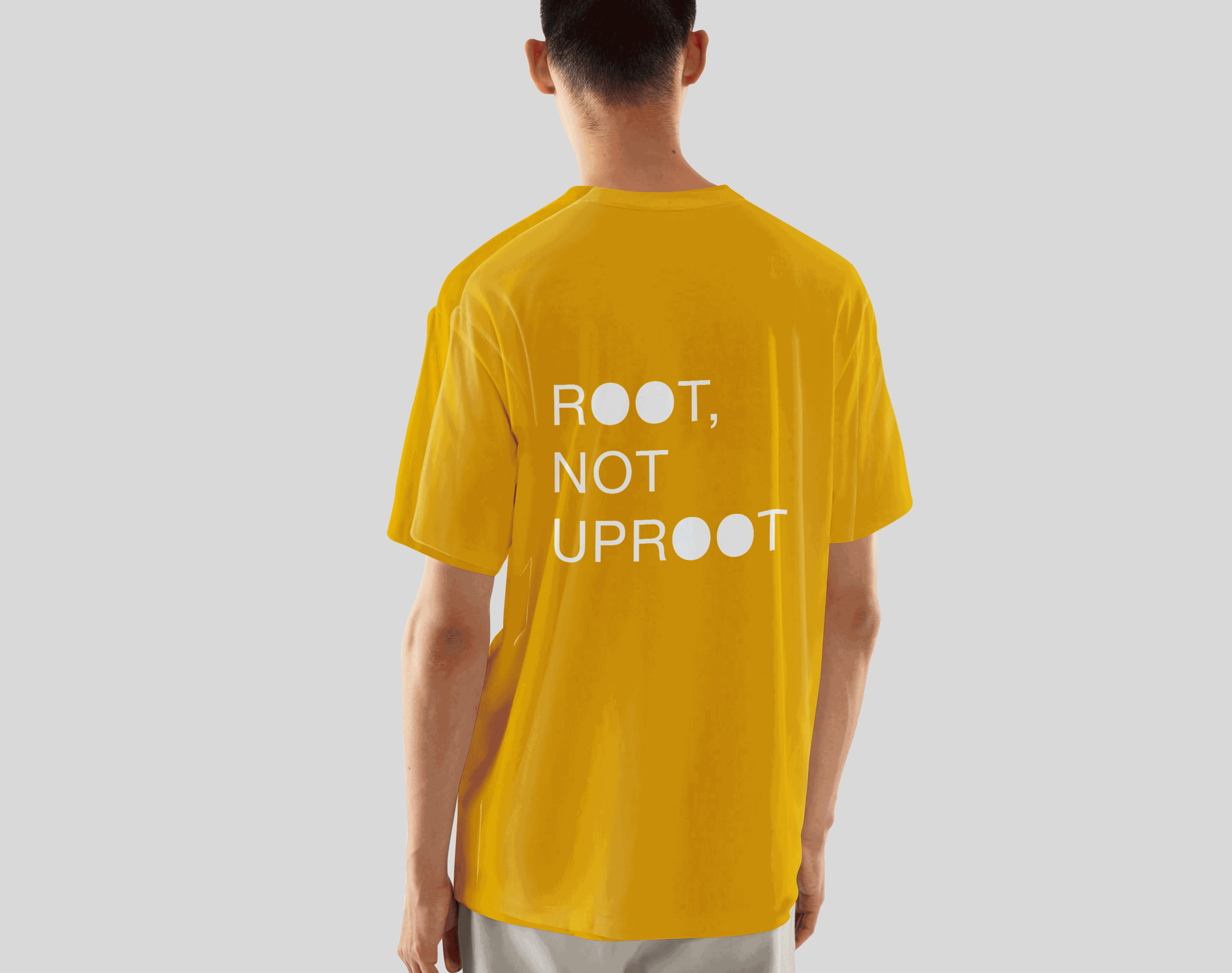
Re-interpreted microscopic patterns, inspired by elements of nature, define the brand’s visual language. The letter 'O' in the logo stands as the unifying core symbol.

OCEAN BLUE
MEDIUM BLUE
C
M
Y
K
100
69
05
00
DEEP COFFEE
C
M
Y
K
41
70
69
39
C
M
Y
K
94
40
12
0
VIVID AUBURN
C
M
Y
K
25
98
100
22
TROPICAL GREEN
C
M
Y
K
98
30
74
16
BLUEBERRY
C
M
Y
K
93
94
00
00
FUEL YELLOW
C
M
Y
K
07
33
100
00
HEAVY METAL
C
M
Y
K
70
64
63
65
The brand features an opulent eight-colour palette, anchored by black and white as the primary tones. Each colour is inspired by different elements of nature.